Built as an alternative, but not a replacement, to Tuwaiq Academy, Tuwaiq Tracker aims to provide a different approach in the UI/UX of navigating the catalog of courses offered by the academy. Overall, my aim was to simplify the UI, extracting only the essential information from each course, and displaying them to the user in a tidy, classical manner. This eliminates loading times and greatly improves site performance.
[Arabic] Video showcase and architecture discussion:
And a mini pdf document I made a few months ago: PDF
The Problem(s)
I've been a user of the Academy website since June 2024. As I browsed the website from time to time, looking for my next course to tackle, I encountered inconveniences that degraded my experience as a user. I wouldn't say they were deal-breakers, but they were relatively easy to fix. Let's take a quick look at what they are:
Course Display Limitations?
As you can see, the pages only display 9 courses at a time - requiring more wait time to load more courses. As a user, I wanted to see more results displayed to me, maybe I was thinking of an "infinite scroll" type of course viewer? Here is a screenshot on a 1920x1080 desktop:
A screengrab of Tuwaiq Academy on desktop showing 9 courses on display per page
And here is the same complaint applying to mobile, showing only 2 courses per full screen!
A screengrab of Tuwaiq Academy on mobile showing 2 courses on display per page
So, my plan is to use more screen real-estate to show more information to the user at a glance.
High Friction
User friction—also called user experience friction or UX friction—is anything that keeps a user from accomplishing a desired action on a website or app. Just like physical friction prevents your shoes from slipping on a slick hardwood floor, digital friction can prevent users from achieving their goals online—for example, making purchases. Source: What is user friction? How to avoid the mistakes and optimize your UX, Fullstory.com
To understand the amount of friction in the academy website, let's take a look at a typical userflow of landing page arrival and then navigating to course catalog:
Three screenshots of a webpage: home screen, loading screen, course offering page, with the loading screen taking 5 seconds to load
The issue I found was that the loading screen takes up 5 seconds to load the courses, but... the user only sees 9 courses once everything loads up. To me, that's extremely slow. So loading one course takes ~1.8 seconds? I just HAD to improve that metric.
The plan is to not introduce any loading screens, beyond the initial load of the website, and displaying ALL available courses at once. Not just 9 courses. In less time.
Course Categorization and Search
Relating my point about displaying all courses previously, one pet-peeve I also found on the Academy's website is the inability to do a global search on courses.
There are 4 categories of programmes offered by the academy:
Bootcamps: lasting weeks to months
Programs: 4 days to 2-3 months, on average
Meetings: think tech-related talks that can span 1-2 days, in-person mostly
Webinars: 1-2 hour webinars, hosted in-person and broadcasted on Tuwaiq Academy's Twitter/X account.
Now, say a user wants to learn Python. When they use the Academy's search function, they can only specify one category of search from the provided four. For someone who has specific needs, like say they are only free for 3 hours per day, this is great because they can target a certain category. But for most people that are flexible, they'd want to say ALL the offerings related to Python, no? Well, the academy doesn't provide that feature, so I will!
Performance
Lastly, let's take a look at the time metrics and how long it takes for the website to fully load. This is done on Google Chrome, using No Throttling:
Tuwaiq Academy: metrics of website load, no throttle: 8.9MB Transferred, 4.8 seconds Finish.
So 8.9 megabytes transferred, and finished in 4.8 seconds. Let's look at a throttled connection simulating Slow 4G in a busy area with less than ideal signal:
A whopping 52 second load time. This is a metric I will be looking to improve on my implementation, for sure.
Approach
To start, I knew I wanted to use Next.js. While I could've gone with a simpler approach, either HTML/CSS/JS or plain React, I wanted the benefits and reusability of React, while maintaining the great SEO benefits of having static pages. For that, Next is perfect. So, I setup a Next.js + TypeScript project and a GitHub repository.
I started with Figma for the design and overall look of the website. I wanted it simple and straight to the point. This was my first draft:
First draft of the design on Figma for Tuwaiq Tracker
The final product did adapt the main components, so I was happy with the design overall. Next, I started building the frontend. Just enough functionality to know it worked.
Now, I had to investigate how Tuwaiq Academy loads their courses. After a few glances at the Network tab in Chrome Dev Tools, I see that they have a public API. Score! I used Postman to send hits to the API so I can study the structure of the responses, to adapt on my website.
For the course database, I opted for MongoDB. My database would only have two tables: courses, to store course information, and settings, to store configurations and last_update_to_courses timestamp. Since the tables are not related, NoSQL was a go. I wrote a JavaScript script (heh) for Node to run, and set up a cron job for it to run every 6 hours. The script would check the API for any courses, then compare the course creation date to the database's last_update_to_courses. If the creation date comes after the last update timestamp, I knew it was a newly added course and I can insert it into the courses table.
Once the database was up and running, and I knew how the website should look like, I started working on the frontend. Was a fun task figuring out which components should stay client-side and which would be server-side.
Lastly, once all was well and hooked-up, I deployed the website to Vercel, the company behind Next.js. It was a simple task of just pointing the Vercel project to my GitHub repository, choosing the runtime (Node 22.x), and firing up the project. I also acquired the tuwaiqtracker.com domain and set it up to point to my Vercel deployment.
System Design
System Design behind the TuwaiqTracker website
UPDATE JUL 10, 2025: As of today, I replaced the CRON job with AWS EventBridge rule, which triggers a Lambda function every 6 hours to perform a course-update check. On failure of the check, I receive Email alerts thanks to AWS SNS. I believe this is a better approach and enhances the monitoring aspects for the website. I will keep the system design diagram as-is, because it's still a valid approach. Just wanted to mention that it's not the approach that the website currently runs on for transparency. 😁
Key Outcomes
Highly Performant Website
Achieved load time improvement of 660% (Avg. 0.787 seconds vs. Tuwaiq Academy's 5.19 seconds) with no throttling. When throttling for Slow 4G speeds, that improvement increases to 1457% (Avg. 3.59 seconds vs. Tuwaiq Academy's 52.24 seconds).
Additionally, the data transferred went down by 96%, using only 342kB vs. 8.9MB used by Tuwaiq Academy.
Tuwaiq Tracker: metrics of website load, no throttle: 342kB Transferred, 0.987 seconds Finish.
Lighthouse metrics: 1.4s FCP, 1.9s LCP, 170 ms TBT, 0 CLS, 1.4s Speed Index
Simpler UI/UX
When you load into the website, ALL available courses are loaded in. I decided to forego showing users courses with a deadline that has already passed. The website is also screen-responsive, and was designed for mobile-first.
Additionally, I added visual cues to courses, for example: Categories now are color-coded by the border, and newly added courses have a blue circle on top of them.
A screenshot of the homepage with all the information presented readily to users.
Rapid search, "globally"
Added the ability to search and sort across all categories. Moreover, since all course data is loaded in the client/browser initially, the search functionality is instantaneous.
Website Accomplishments
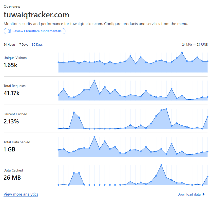
As of June 23, 2025
The website received 1650 unique visitors last month.
6.8 Average position over the past 3 months on Google Search
A snapshot of CloudFlare statistics for the dates 24 May to 23 June showing 1.65k unique visitors, 41.17k total requests, 2.13% cached, 1GB total data served, 26MB data cached
Challenges
Data manipulation: Parsing data from Tuwaiq Academy's API and deciding which data is actually meaningful and needed for my implementation.
Server-side vs. Client-side components: As this was my first standalone project with Next.js, it was a bit of a fun challenge trying to decide and debug these components.
Adopting a responsive UI: While I knew the basics of CSS, Tailwind, and responsiveness, applying them in-practice was tedious - testing on multiple screens and devices, making sure the look is consistent was rough. Also, Chrome Dev Tools provide screen resolutions for popular devices like iPhones, but how the website look in Dev Tools vs. an actual iPhone devices varies a lot. So there was some back and forth.
Conclusion
I'm very proud of this project, not only for the experience I gained building and maintaining it, but also for the fact that it's being used by hundreds of people at the moment. I always wanted a public-facing website that served a purpose!
Screenshots
Wide-screen view of the website, on an iPad screen